The views and opinions expressed in this website are not necessarily those expressed by the National Oceanography Centre or the University of Southampton. The opinions and views expressed are those of the authors of the website


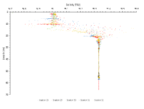
Salinity did not vary immensely, however, the surface waters were relatively fresh compared to the deeper waters. The pycnocline started at approximately 10m, and there was an increase within another 10m of 0.3 psu. Below the depth of 25m the salinity was remained constant throughout the rest of the depth profile. Overall we can conclude that the water column was stratified.
The halocline is caused by warm fresh water overlying cold saline water. The warm fresh surface water is relatively well mixed compare to the cold saline water which is highly stratified. This is shown by the closeness of the data points below the halocline and the relatively distanced data points above it.
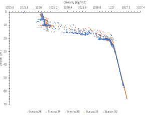
The density levels also increase in depth with the pycnocline. The density increases
from 1026 Kg/m3 to 1027 Kg/m3. The pycnocline occurs between 10-
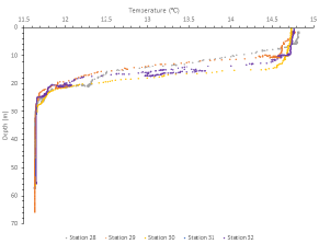
On all of the time series stations the thermocline can be seen between 10-
Physical Introduction
Thermocline
Halocline
Pycnocline
A CTD was deployed at each of our time series stations (station 29-
Figure 3.9 Scatter graph of Temperature against Depth showing a distinct thermocline
Figure 3.10 Scatter graph of Salinity against Depth showing a distinct Halocline
Figure 3.11 Scatter graph of Density against Depth showing a distinct Pycnocline