
Any opinions expressed on this website do not reflect the opinions of the University of Southampton or the National Oceanography Centre


Results
Figure 4.4.1 shows the salinity and temperature values for both surface and 1 metre measurements. The temperature remains relatively constant between 0 and 1 metres, behaving as expected, and increasing whilst the tide is ebbing. This is due to the water level decreasing, allowing greater heating of the whole water column; as well as warmer riverine input. As the estuary is well mixed and the tidal range over the period measured relatively low, the range of temperatures from 0 to 1 metres is small. At 0830 UTC the temperature change from 0 m to 1m is insignificant going from 17.93°C to 17.96°C. However at most of the times sampled the temperature decreased slightly with depth.
Salinity behaves inversely with respect to temperature and so consequently does not change much with depth. Instead salinity decreases from 34.22 to 32.40 as the tide ebbs and increases back to 34.27 when the tide floods. This is simply caused by the increase in freshwater flowing down river. This can be explained by the flow diagram (Figure 4.4.7) where the current (m/s) in the majority of the data collected was greater at 1 metre than at the surface. This could be due to a number a factors including wind, which was blowing upstream (Northerly) against the ebbing motion of the current at the time of data collection. There is a spike of salinity (37.82) at 1 metre depth, at 1430 UTC, which could be due to the tide flooding and the flow direction changing, so denser salt water is more prominent.
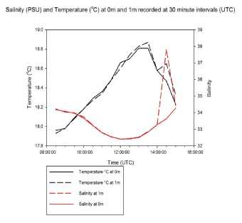
Figure 4.4.1 Line Graph to show the relationship between temperature and salinity with time and depth.
Figure 4.4.2 shows a contour graph of the full data set of temperature rather than the surface differences. It shows a clear pattern and reinforces figure 4.4.1 with temperature not changing significantly with depth, but clearly changing with time. The 1.5m reading at 1200 UTC seems to be anomalous due to the unusually low temperature reading at the shallowest part of the tide. This is due to unforeseen circumstances in which the Bill Conway disturbed the sea bed in the area we were measuring.

Figure 4.4.3 Contour plot showing the full data set of salinity against time and depth, also showing the depth change with time represented by the grey blanked area. The crosses represent the points where measurements were taken.
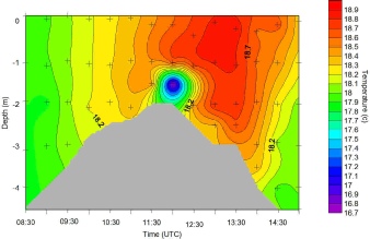
Figure 4.4.2 Contour plot showing the full data set of temperature against time and depth, also showing the depth change with time represented by the grey blanked area. The crosses represent the points where measurements were taken.
Figure 4.4.3 shows all data points and reinforces the findings of figure 4.4.1. Again it is inversely correlated to temperature in all but 2 areas. The first area is due to the Bill Conway, however the second, shown by a spike at 1 metre on figure 4.4.1, is due to high current flow shown in the flow diagrams.
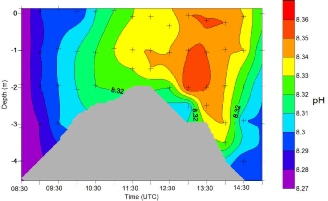
Figure 4.4.5 A pH contour plot showing the minimal changes with pH across the tidal cycle. Where the depth change with time represented by the grey blanked area. The crosses represent the points where measurements were taken.
Figure 4.4.4 shows a contour plot of dissolved oxygen, time and depth. A minimum of 114% was observed at a depth of 3 metres at 0830 UTC and the maximum of 131% was observed at 1430 UTC at the surface. This is due to a lack of chlorophyll and therefore lack of oxygen production. Whereas, at 1430 UTC where conditions were at an optimum for a chlorophyll maximum, the oxygen percentage is at a maximum.
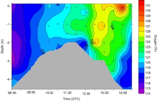
Figure 4.4.4 Contour plot to discover the pattern of dissolved oxygen over the tidal cycle. Where the depth change with time represented by the grey blanked area. The crosses represent the points where measurements were taken.
Figure 4.4.5 shows pH against depth and time. It shows variation with the tidal cycle with pH increasing with ebb and decreasing with flood. It ranges from 8.27 at 0830 UTC to 8.36 at 1300 UTC. This shows an insignificant change and is due to errors made in the measurements as there is a small range.
Chlorophyll is illustrated by figure 4.4.6 which strengthens figure 4.4.4 and the rapid increase in oxygen at 1430 UTC. At 1400 UTC the chlorophyll concentration rapidly increases. This is due to cooler, more nutrient rich, tidal waters flooding back into the area. This, in conjunction with the peak of irradiance during the day, supplies the phytoplankton with the optimum conditions for photosynthesis.
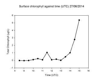
Figure 4.4.6 The relationship of chlorophyll with time, averaged from samples taken at the surface.
The flow diagrams, figure 4.4.7, show the speed in m/s (denoted by the length of
the arrows) and the direction of the flow changing with depth and the tidal cycle.
The shaded area indicates the depth of the water column. The currents flow south,
160-
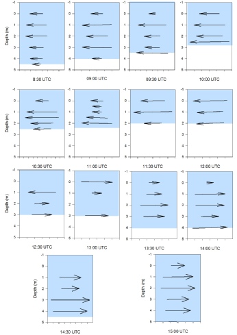
Figure 4.4.7 A flow diagram representing the speed and direction of current below and on the surface of the water during the tidal cycle. With the larger arrows representing larger currents and the flow changing from South in the ebb to North in the flood.